
2026 Color of the Year
Every year, a leading color stands out as a favorite among design and paint authorities. Here are the “Color of the Year” picks for 2026 from several major resources.
Pantone (most widely cited)
Color: Cloud Dancer
Description: A soft, billowy white neutral (Pantone 11-4201) meant to evoke calm, serenity, and a fresh start. This is the first time Pantone has chosen white as its Color of the Year.
Etsy
Color: Patina Blue
Description: A blue-green tone inspired by aged copper and trending interior aesthetics.
Sherwin-Williams
Color: Universal Khaki
Description: a warm, earthy neutral.
BEHR
Color: Hidden Gem
Description: A smoky jade greenish shade chosen as its own color trend highlight.
What “Color of the Year” Means
Many paint companies and trend forecasters choose a color each year that they believe captures cultural, emotional, or design trends — and these choices can differ between brands. Pantone’s pick is the most globally recognized, but other brands’ selections are widely used in interior design.
Why It Matters for Interior Design
Pantone’s Color of the Year often influences:
Paint color releases
Kitchen and bathroom finishes
Cabinetry and tile trends
Décor and accessory palettes
How Designers Use the Color of the Year
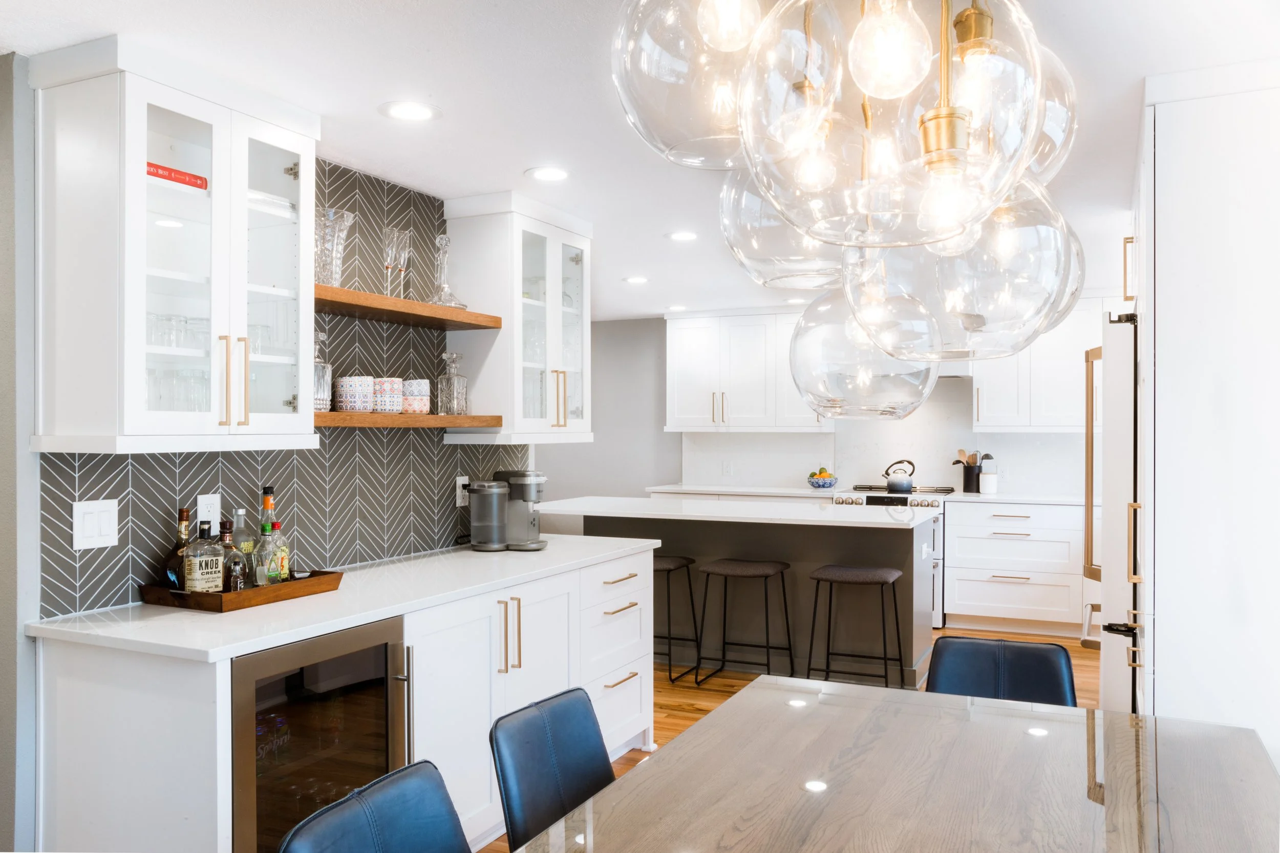
Designers rarely use the Color of the Year as a dominant wall color in kitchens or bathrooms. Instead, they take a more nuanced approach by integrating this color into the design in subtle yet deliberate ways.
For example, they might use the color in decorative accents, such as backsplash tiles, accessories, or even small appliances. This approach allows the space to remain contemporary without sacrificing its timeless appeal. By layering the Color of the Year in thoughtful details, designers create a balanced environment that feels both fresh and enduring.